A little room to read
On spacing, small distractions, and making a page worth returning to.
In this article
You open an article saved weeks ago, looking for one sentence. You remember roughly where it was. First, though, a banner slides into view. Then a subscription prompt. The sentence can wait, apparently.
A blog is often visited this way: with a small purpose, and less patience than its maker imagined.
Start with the next sentence
The title gets someone to open a page. After that, the writing needs room to hold their attention.
Dates, tags, and menus still have work to do. A publication date helps place a tutorial in time; a contents list helps someone find a passage. Giving each a clear place is usually enough.
| On the page | What it helps with | Where it belongs |
|---|---|---|
| Title and summary | Choosing a piece | At the beginning |
| Publication date | Understanding its context | Beside the other article details |
| Section links | Returning to a passage | Within reach, beside or above the prose |
| More articles | Finding something else | After the piece ends |
The date on a diary entry carries a different weight from the date on a JavaScript tutorial. A little flexibility in the layout lets each remain what it is.
Leave useful space
A caption belongs close to its image. A heading needs more space above it than below, so it stays with the paragraph it introduces. These small distances tell us how to read a page before we have read a word.
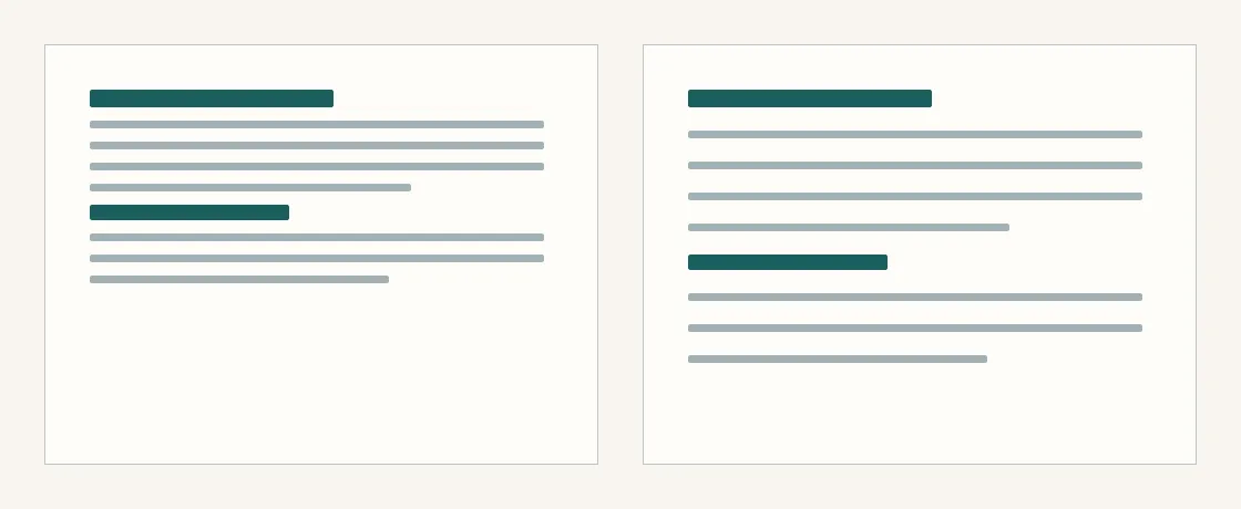
The words stay the same. The space around them changes the pace.
Hide the dividing lines for a moment. Can you still see what belongs together?
If the groups become hard to distinguish, adjust their spacing before putting the lines back.1
Make room for unfinished thoughts
Some observations are only a few sentences long. They can stay that way. Writing one down gives you somewhere to return when another thought arrives.
flowchart LR
  accTitle: Returning to a note
  accDescr: An observation becomes a note. Reading it later may lead to a longer piece.
  A[Notice something] --> B[Make a note]
  B --> C[Read it later]
  C --> D[Write a little more]
There is no deadline for that last step. A short note may already say all it needs to.
Let the page settle
A title moving into place can help connect a click with the article it opens. When the movement ends, the reader should be free to forget the interface.
There is still room for a particular color, a curious shape, a small detail that makes the site yours. Let it catch the eye on the way in. The words can take it from there.
Footnotes
-
Check at a narrow width, too. Elements that belong together in a desktop row need to keep that relationship when stacked on a phone. ↩
Text CC-BY-NC-SA-4.0Code examples MIT